
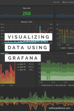
Grafana is a really powerful tool used throughout the tech industry to visualize time series data. It’s open source software that allows you to create visual dashboards comprised of panels so that you can view and analyze your data. People frequently use it to monitor the health of their network and connected devices but in our setting, we can visualize any data we collect via Home Assistant.
Check out my last article on setting up InfluxDB to learn about a time series database and how to set one up.
Installing Grafana
In this tutorial, I’m going to be running Grafana on a Raspberry Pi that’s also running InfluxDB and Home Assistant. My setup uses docker to manage and isolate the applications. First off, I’ll download a docker image for Grafana for a Raspberry Pi.
|
1 |
docker pull fg2it/grafana-armhf:v5.0.4 |
I’m using docker-compose to manage my docker containers so I’ll add Grafana to my docker-compose.yaml file. You can see in the below snippet I add it as a new service that depends on influxdb. I also forward port 3000 outside of the container so that I can access the application.
|
1 2 3 4 5 6 7 8 9 10 11 12 13 14 15 16 17 18 19 20 21 22 23 24 25 26 27 28 29 30 31 32 33 |
version: "3" services: homeassistant: image: lroguet/rpi-home-assistant:latest volumes: - /home/pi/home-assistant-config/configuration:/config - /etc/localtime:/etc/localtime:ro network_mode: "host" ports: - "8123:8123" devices: - "/dev/ttyACM0:/dev/zwave:rmw" depends_on: - influxdb influxdb: image: hypriot/rpi-influxdb:latest volumes: - /var/influxdb:/data network_mode: "host" ports: - "8086:8086" environment: - "PRE_CREATE_DB=home_assistant" grafana: image: fg2it/grafana-armhf:v5.0.4 volumes: - /var/grafana:/var/lib/grafana network_mode: "host" ports: - "3000:3000" depends_on: - influxdb |
Setting up Grafana
Now that Grafana should be up and running, it’s time to log in and configure it so that it can read the data from your InfluxDB database.
First, open up a browser and go to port 3000 for the IP Address running your Grafana instance. For me that’s: http://192.168.1.9:3000 (your IP address will probably be different).
If all went well during the docker setup, the page should load and you are able to log in. Login with the username admin and password admin (feel free to change this after logging in the first time).
Once logged in Grafana will give you some hints on what to do next to get up and running. First, we need to connect it to InfluxDB. Click on the “Create your first data source” button and enter in your details like in the screenshot below:

Some details you may want to change:
- If your InfluxDB instance is running on a different host, you’ll want to change the HTTP URL to specify the IP address rather than
localhost - If the database name is not
home_assistantyou should change it to the appropriate name under “InfluxDB Details”
Once you enter in your information click “Save & Test”. Grafana will automatically test the connection and save if it could establish some connection.
Creating Grafana Dashboards
The next step is to create visualizations from your captured data. For the purpose of this article, I’m going to be creating a graph of the wind speed at my house. The data was captured using the Dark Sky sensor of Home Assistant.
A Grafana Dashboard is essentially a webpage that contains various panels. Grafana has support for lots of different panels and they can be arranged in various ways on a dashboard.
If you need some inspiration on what to create dashboards for, do a quick Google Image Search, there are a ton of Grafana users who have some really cool and useful dashboards created.
So starting out, we need to create a new Dashboard. Click the “Create your first dashboard” button at the home screen.
Now you are on your first dashboard and can add panels to it. For the purpose of this article, I’m going to create a graph panel.

The graph panel will then be created. To add data to it click the “Panel Title” at the top and then go to “Edit”.

Fill in the data query like how I’ve done in the screenshot below, you should see the graph populate as you choose the query.

Let’s break down this query. The first row is choosing what to read from our database. We’re going to read mph data from the “dark_sky.wind_speed” entity:
|
1 |
FROM default mph WHERE entity_id = dark_sky.wind_speed |
To display the data we need to select what we want to display from the wind_speed entity. In our case, we are going to take the average of all the wind speeds in each time interval group.
|
1 |
SELECT field(value) mean() |
Finally, we group the data in 1 seconds intervals (that we then take the mean of) and display using a linear fill.
|
1 |
GROUP BY time(1s) fill(linear) |
Feel free to customize these settings to generate a graph that displays the data well for your use-case. You can also rename the panel on the “General” tab, as well as change a lot more other settings.
Check out some of the links at the bottom of this article for more information on Grafana dashboards and panels.
Next Steps
Grafana is a really powerful tool that can create some awesome visualizations. I’ve just started to scratch the surface of its capabilities. Personally, I’m going to be looking into using something like Glances to feed more data into Home Assistant from my home server, that way I can monitor disk usage and load across multiple devices across the network. Some other cool ideas:
- Use the Grafana API to export images of graphs and display them back on Home Assistant
- Use a Raspberry Pi (or something similar) to create an always-on display with one of your dashboards pulled up
- Create a subdomain using nginx/apache for Grafana